
Craft/June 14, 2022
Designing the Dashibase Logo

Swee Kiat Lim
Co-founder
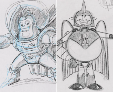
I always loved looking at the unused sketches and drafts of my favorite Pixar movies. Because behind every Pixar movie, there lies a second story. One that takes place backstage and behind the scenes. A story told by cutting room floors littered with the craziest, most atrocious ideas, dreams, fantasies that were ultimately discarded and yet critical to the genesis of the final masterpiece.
Having decided to double down on Dashibase, we recently began revamping the branding, UI, logo, and more. This short exposé of the new Dashibase logo is our attempt to pull back the curtain and tell a story of what went on behind the scenes, baring our musings and motivations. We hope you enjoy it.
To make this remotely readable, we had to organize everything into a sort of narrative. While our intentions are accurately represented here, the design process was not as linear as described below. In fact, our design process was about as linear as a ball of yarn. That is to say, not linear at all.
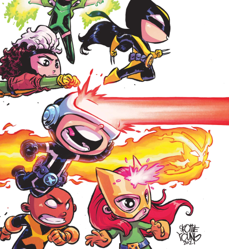
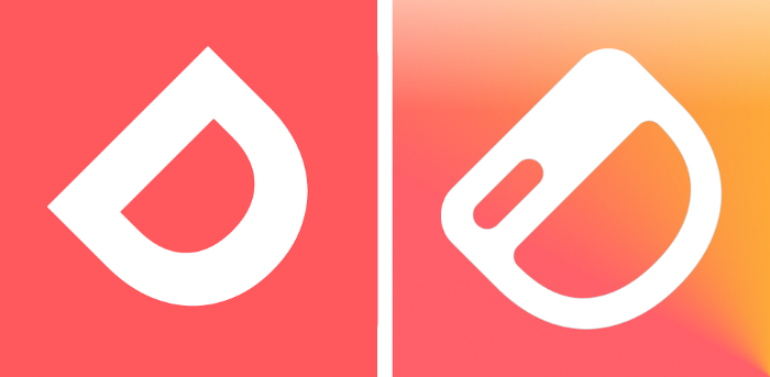
Our OG Logo
Simple and straightforward. We took the "D" from Dashibase and tilted it to add some visual interest. Absolute genius, we know. Any resemblance to a smiley face is very intentional. Unfortunately there is no special meaning behind the coral palette. We needed a quick logo and favicon for our MVP and spent 5 minutes rendering this work of art on Figma.
Some issues. Because we literally rotated a Poppins uppercase "D", the stroke width at the top and bottom of the "D" is thinner than the side (see below). This makes it seem more like the letter "D" and less like a smiley face, which we set out to fix in the redesign.
We wanted the new logo to allude to dashboards, and possess more depth, to mean more than just the first letter of Dashibase. We wanted it to feel jolly, playful, and modern. Just like our product, it should be a breath of fresh air from boring dashboards and admin panels. Maybe even child-like?
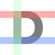
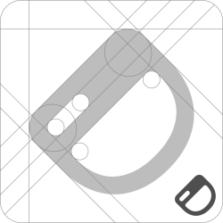
In the course of this article, you may see diagrams of logos with superimposed rectangles and lines. We found this to be a surprisingly effective way of making the design process appear more sophisticated than it actually was.
Dashboard-ish
We first opted to keep the "D" and played with dividing the counter (the negative space in the letter). By cutting up the counter into sub-dominant and dominant forms, we get what resembles a dashboard’s navbar and main content respectively.
This is a small step in the right direction but the result felt a little too Gothic and cold.
Round and jolly
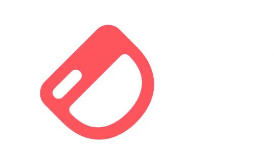
Our solution was to melt every corner into a curve and reduce the width of the “navbar”. The curves add more warmth and evoke more of our beloved smiley face :D
At this point, the logo is also starting to resemble a cute Cyclops.
Dominant and sub-dominant
Next, we experimented with reducing the length of the upper rectangular space (the “navbar”) to establish clearer dominant and sub-dominant forms. Channeling our inner Rowena Reed, we found that a slightly irregular length (less than half but not a third) and having it left-aligned instead of center-aligned created the extra depth and visual interest we were looking for.
We then increased the height/thickness of the “navbar” rectangle to match its surrounding stroke width.
Bonus points for looking like a winking happy smiley ;D
Askew
We kept the 45-degree tilt, which added a whole lot of good stuff — dynamism, playfulness, teetering between D, dashboard, and smiley.
This does make the composition slightly iffy. The tilted "D" creates too much space in the upper left corner, especially when we are using the logo in square, circle, or squircle icons. This is compensated somewhat by the extra logo footprint we get from reducing the length of the “navbar”.
The 45-degree tilt also lets us have fun with the logo. For example, we show a rocking version of our logo on our app loading screen. It is both functional (the moving logo shows that it is loading) and delightful (it’s like a smiley looking at you).
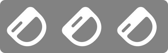
Colors
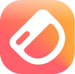
Persisting with the original coral theme, we added more warmth to complement our jolly logo. Gradients are all the rage and we love it over here at Dashibase too. Our chosen palette was an angular, or conic, gradient going from coral to a warm amber.
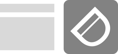
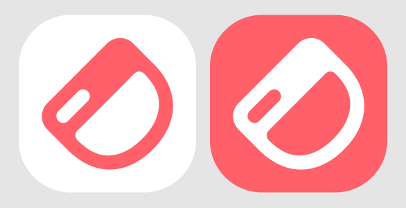
For visually simple use cases, like favicons, we have monochrome versions in coral and white.
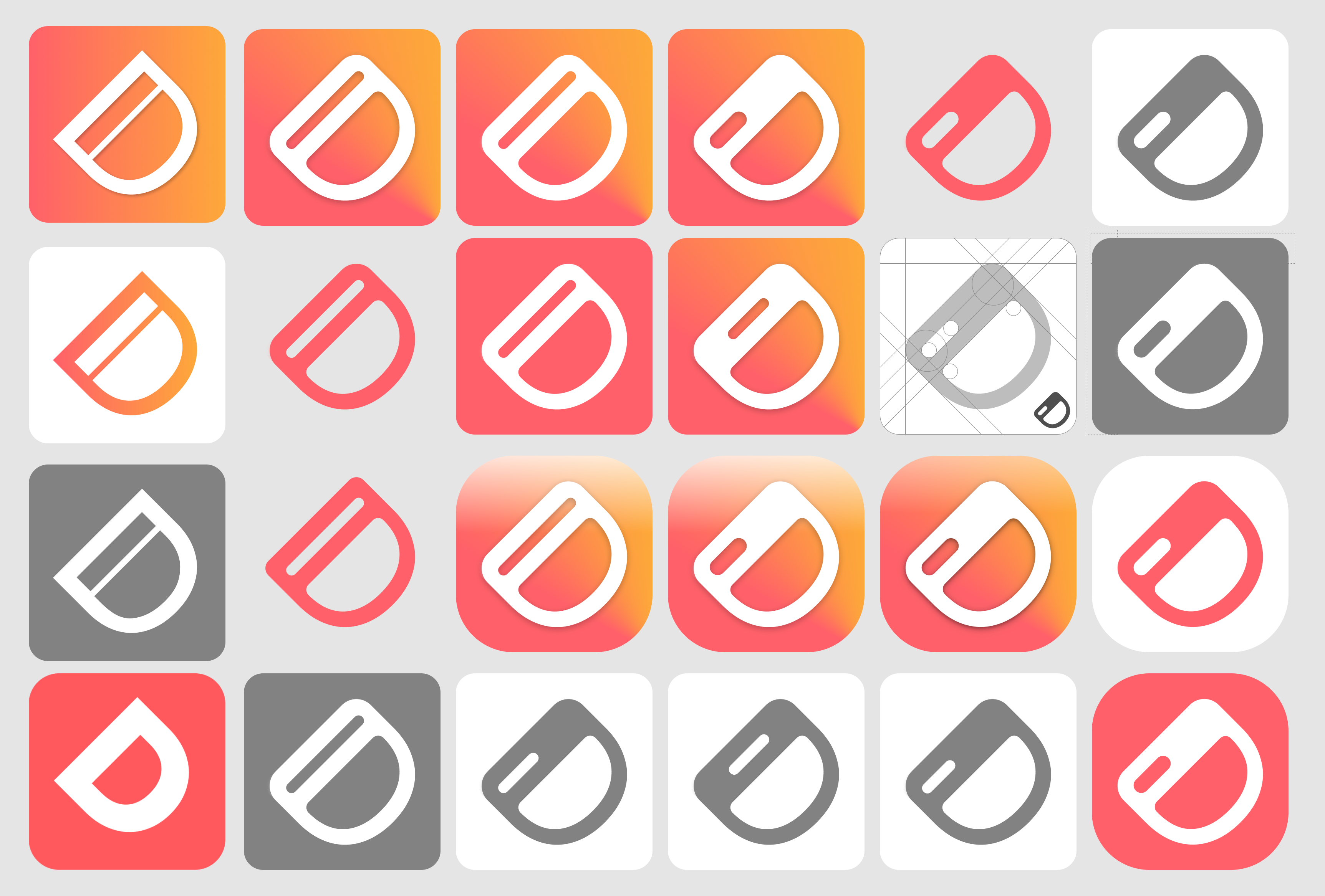
The Logo 2.0
Having pivoted multiple times in the past few months, it feels good to be able to focus on a single thing and we are grateful to our early adopters for helping us reach this stage. As an early-stage bootstrapped startup, designing a logo is a luxury. But we also see it as an opportunity for us to demonstrate what we value at Dashibase.
Although we are no Kenya Hara or Ian Spalter, we hope that our new logo comes to embody the things we hold dear at Dashibase — craft, simplicity, and child-like joy. And we can’t wait to see where this takes us next ;D