
Craft/June 27, 2022
You Should Be Adopting (Copying) Notion’s UI for Your Software

Alfred
Co-founder
Notion’s user interface (UI) patterns are becoming the new standard for software.
Not just because Notion’s UI is great. That alone is not enough to become the new standard.
It is also because a whole generation is growing up using Notion.
The Notion generation
If we just look at the numbers:
- Notion’s user base grew from one million users in 2019 to four million in 2020, to… wait for it… 20 million in 2021.
- Its subreddit has more than 200,000 members, ~8x of Figma’s and ~80x of Canva’s.
- There are countless self-initiated Facebook groups, some with tens of thousands of members.
Few software companies have such growth and enthusiasm for their product. Yes, Zoom, Slack, and Canva might have a lot more users (for now). But nobody raves about them like they do with Notion. There is an entire economy around Notion.
But more importantly, the next generation of builders and creators are growing up with Notion. When my co-founder Swee Kiat was interviewing university students for startup ideas, almost everyone he spoke to is using Notion—for everything and anything. Taking notes, creating websites, building apps. Some are even paying for it (while the working adult behind this blog post is still on the free plan).
Notion has been “training” the next generation with its UI. Very quickly, Notion’s UI will become the new UI standard for most software.
The new standard for software UI
I grew up in the 90s. Microsoft Office is pretty much the standard for software UI since. That was nice when personal computing was new. It is just terrible now. Most things are hidden behind several layers of menus. Keyboard shortcuts are obscure combinations of keys. Doing anything is slow and hard.
Notion’s UI is a huge improvement. Here are some of the UI patterns you should adopt (read: copy) because your users will be expecting them.
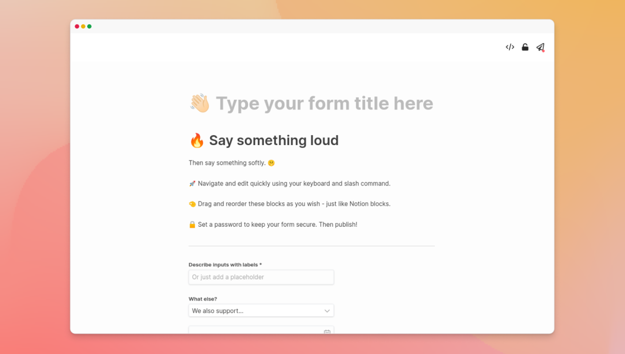
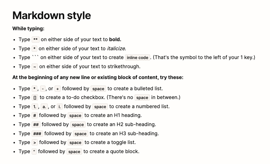
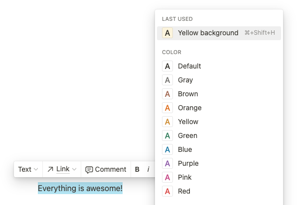
Markdown formatting
I was first introduced to markdown formatting while using Dropbox Paper at Buffer. Formatting text is so easy. It felt so obvious that I was wondering, “why couldn’t we do this before?”
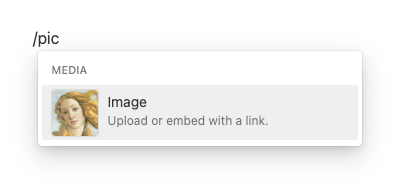
Slash command & command palette
The slash command concept probably came from Internet Relay Chat (IRC) but has since been popularized by Slack and then adopted by many other tools. I can simply type “/” to get a list of commands and type additional text to narrow down the options.
The CMD+K command palette is essentially the same concept but for the entire app. Users use the command palette to navigate around the app or take “global” actions much more quickly.
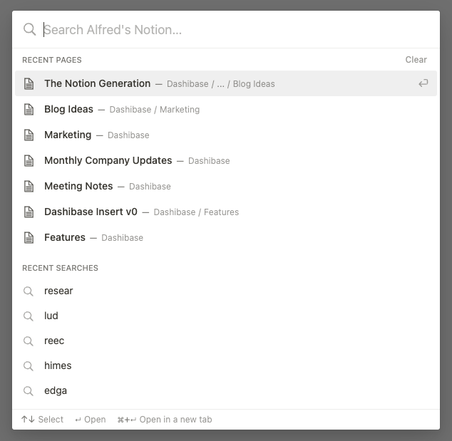
What I love is I do not even need to lift my hands off my keyboard. This is way better than remembering obscure shortcuts because I can type “picture” and still get the “image” command. But, at the same time, Notion tries to “train” me to remember shortcuts by showing me the shortcuts alongside the commands. If I use the command often enough, I will learn the shortcut, even if it is obscure.
Drag-and-drop blocks
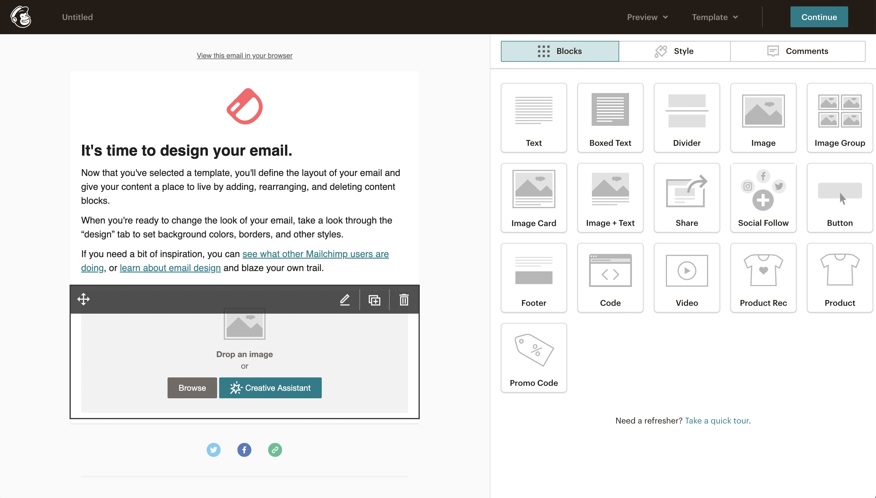
Drag and drop has been around for a long time but Notion made it better.
I was “trained” by Mailchimp’s drag-and-drop email builder. But it feels clunky now. I have to drag a block across the screen, then click to edit the block, and then hit “Save & Close”. With Notion’s slash command, I can easily add and edit a block by hitting a few keys.
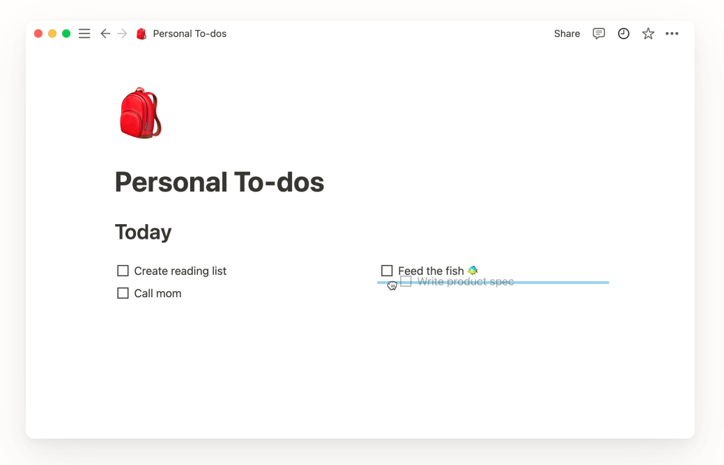
Also, Notion found a good middle ground between “I can put things anywhere” (i.e. messy) and “each block takes up the full width” (i.e. inflexible). Each Notion block takes up the whole width, and you can drag and drop a block beside another block to get two (or more) columns. The columns will have the same width but you can adjust them. It’s flexible yet tidy by default.
UI principles for the 2020s
Copying the exact UI can help you make your software UI good quickly. But you need to understand the principles behind them to build great software. If I were to try to abstract general principles out of Notion’s UI, they would be:
- Reduce switching between the keyboard and the mouse so that your users can move quickly. If your users need to type with both hands, switching to using the mouse is a hassle. Shortcuts will allow them to do things within your app more quickly. If they need to use the mouse, they should ideally be able to hit the shortcut keys with the other hand. Check out the experience on popular software such as Notion, Figma, and Superman.
- But don’t make them remember obscure shortcuts unless they are “trained” by popular apps or your app. Slash command and CMD+K command palette are safe options as they become increasingly more popular (e.g. Superhuman, Linear, and Slack).
- Make it impossible to make things ugly. Full flexibility isn’t always great. Case-in-point: I need no effort to make a Google Doc messy. On the other hand, Notion restricts how I arrange my Notion blocks and allows only one font style so that I cannot make things ugly. All customizations, such as emoji icons and colored backgrounds, only make things nicer.
- Keep menus contextual. It is common to put menus either all at the top (e.g. Microsoft Office) or on the side (e.g. Photoshop). Finding the right option often means looking through multiple dropdowns. Notion keeps app settings in the left navigation panel, page settings in the upper-right corner of the page, and slash command and block settings by the block. This makes them easier to find and feel less overwhelming.
Just like how the Stories format became ubiquitous after Snapchat introduced it, Notion’s UI will become common in most tools in the coming years. It will be silly to stick to old UI patterns when the next generation is familiar with a set of new and more powerful UI patterns.
Adopt these UI patterns and innovate on them.
In the coming weeks, we will be adding the new UI patterns into Dashibase to give you more flexibility and power in building your Dashibase.
If you are not on our waitlist yet, join us! :)